


5
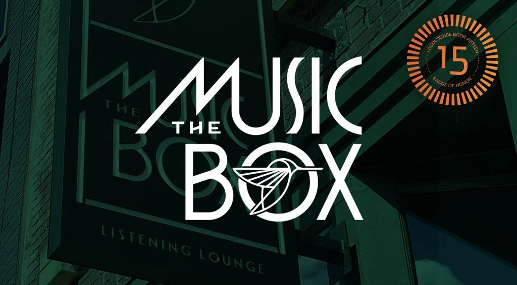
Music Box
8
Disco Chicken

9
Sizz N Fizz

7
Visit Milwaukee
13
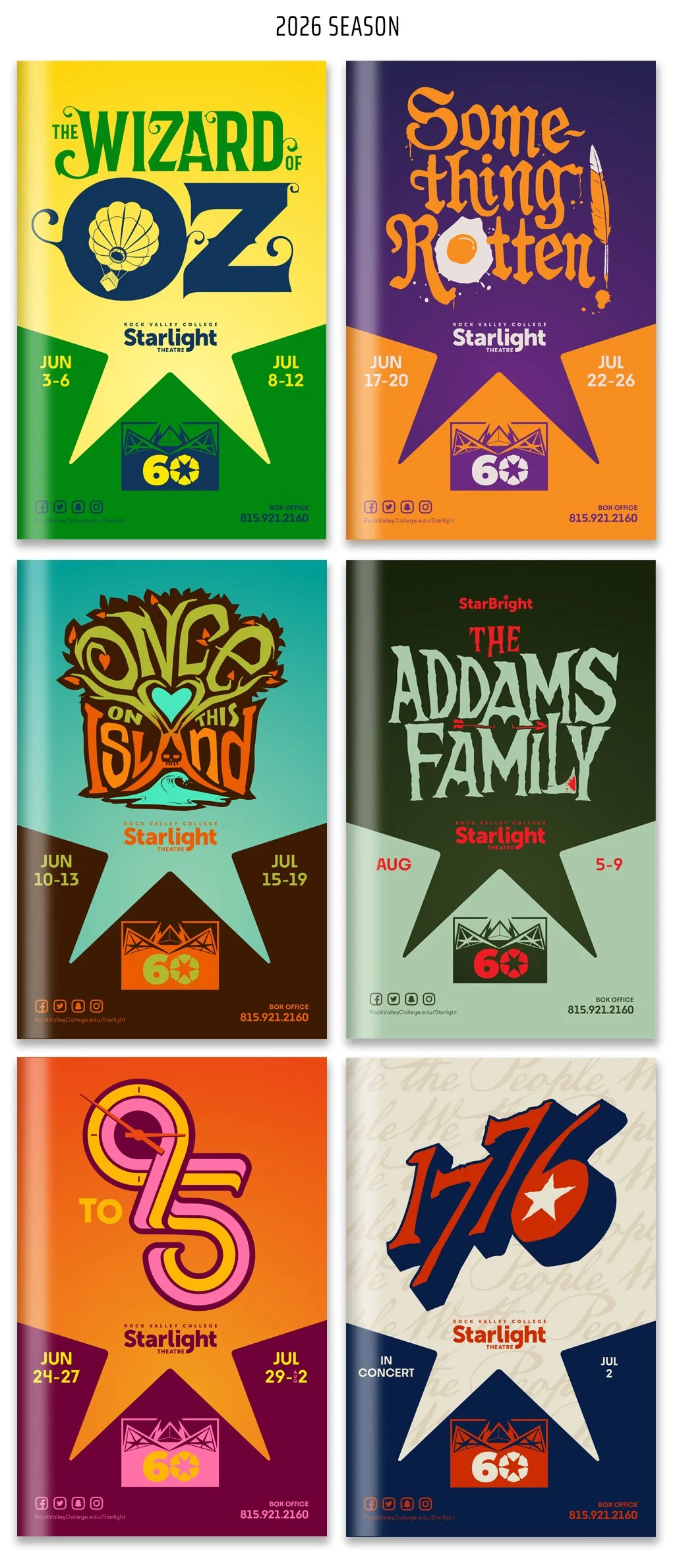
Starlight

6
Lyfe Dispensary

6
Greenlink

6
Bubu

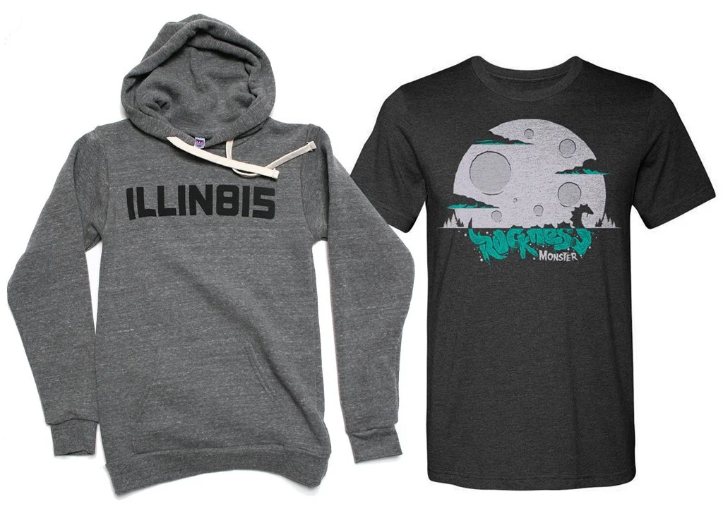
4
Roadhouse
10
Fitzgerald Equipment

5
Discover Peoria

5
O'Connor
6
Normal Public Library

8
Stampede

4
Specapp
7
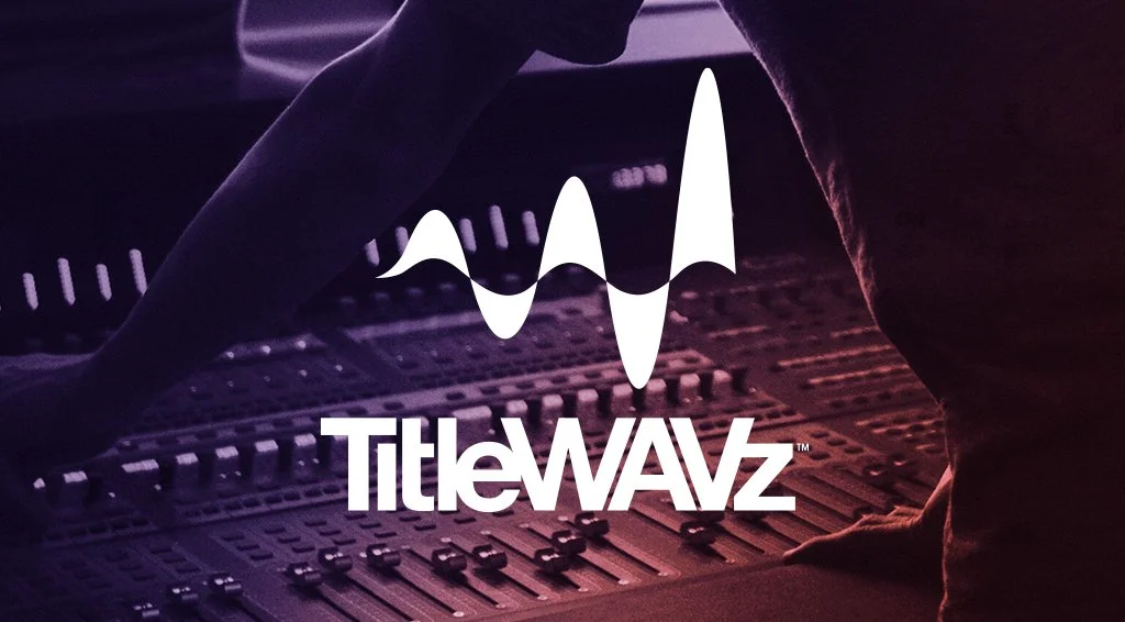
TitleWAVZ

6
VeeDubs

5
Allseasons
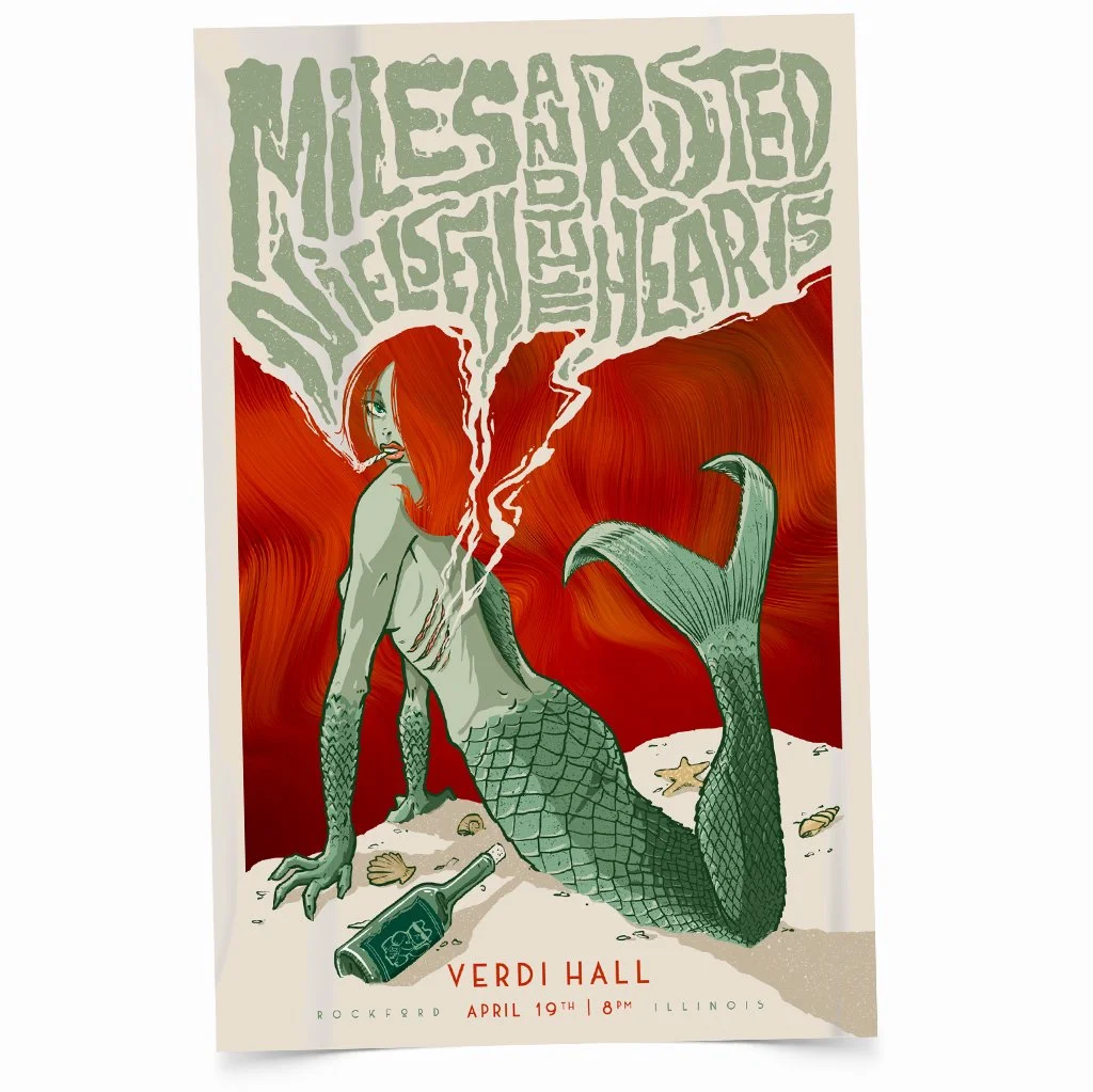
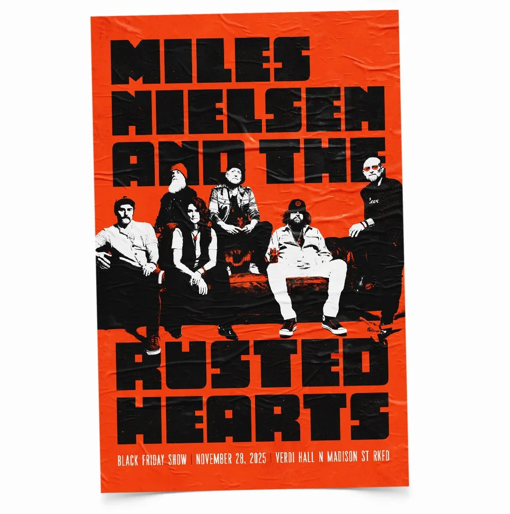
11
Lino's

6
Macktown

11
Iverson

4
Prairie Street 10
5
Gourmutts
5
Dairyhäus

4
Bad Humor
8
Normal
13
Rockford Art Deli

8
Lindeblad
5
Julia Hull Library

5
Peoria Rivermen
7
Risepointe
5
Simeon Pratt
4
The Ranch

3
Oh Baby
2
Simply Chicago
4
Swift
4
Dexios
4
The Proving Ground

3
Midwest College Wake Tour

5
West Rock
2
Pramantha
4
Green

4
Ewald
3
AIA Trust
4
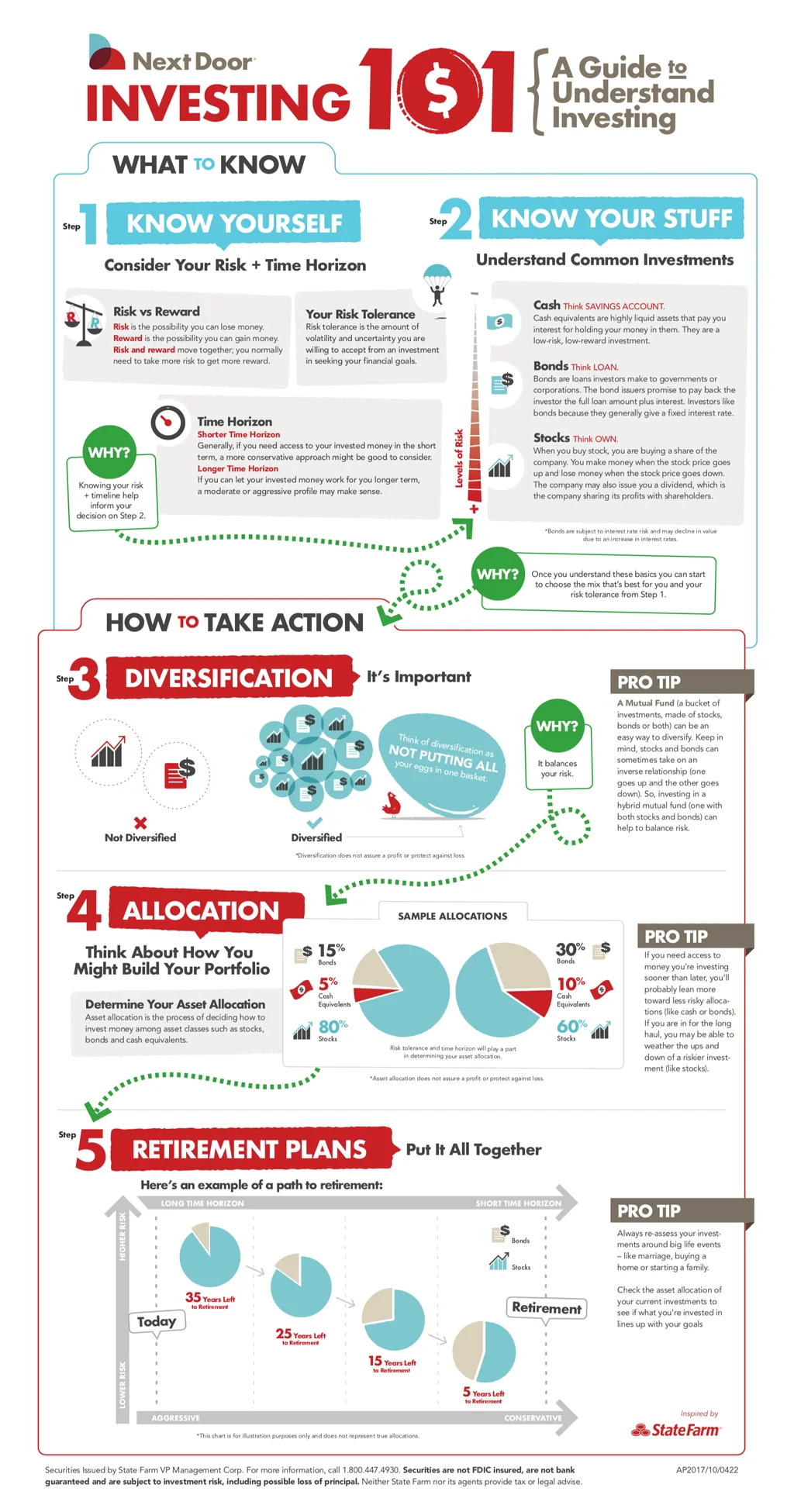
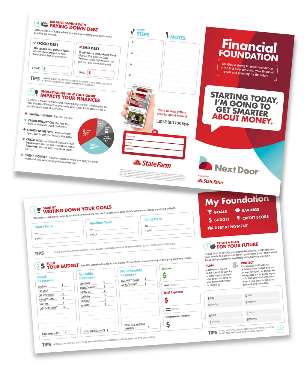
Next Door